|
Jun 29, 2008
Lawrence Solomon: What I told the Petroleum Club
By Lawrence Solomon, Financial Post
I’m surprised to see so many of you here today. I thought you might be at trial, for your global warming crimes. James Hansen - he’s one of the leaders in the climate change movement in the U.S. - wants you in court. “CEOs of fossil energy companies know what they are doing,” he stated yesterday. “...they should be tried for high crimes against humanity and nature.” Come to think of it, David Suzuki also sees those who abet CO2 emissions as criminals.
And you know what, I bet some of you see yourselves as criminals - or something close to it - because there’s something in human nature that makes us feel guilty, even for crimes we didn’t commit, let alone for non-crimes. And I bet some of your friends and associates might look at you sideways. And your children may be teased and made to feel guilty about what their dad does for a living. Even more, you’ve been cowed into silence. Instead of making your case to the public, instead of defending yourselves and your industry, you’ve thrown in the towel, or tried to be greener than green, hoping to avoid recrimination.
As many of you know, I and Energy Probe, my organization, have long been critics of the energy industry. We have opposed Arctic pipelines and tar sands that we considered to be ill-advised. We have opposed nuclear plants and big dams. We favour conservation and renewable energy. We like clean and economic energy, something we have had too little of in Canada. For this, some of you in this room bear some responsibility. But on the global warming issues, based on the evidence to date, you have nothing to feel guilty about. Albertans have nothing to feel guilty about either. No crime has been committed. No known harm has occurred. You’ve been had.
The fears of cataclysm over global warming are unfounded. There is no consensus on climate change, despite what Al Gore and the UN’s Panel on Climate Change would have you believe. Let me tell you why most people think that global warming is a serious problem. It comes down to one number: 2500. That’s the number of scientists associated with the UN’s Panel on Climate Change that the press reports has endorsed the UN Panel’s conclusions. These are the conclusions that get released in the UN’s mammoth reports every six years or so, and that then dominate the media airwaves for weeks. “2500 scientists can’t be wrong,” the press always says, explicitly or implicitly. Without that number, it would have no basis for the claim that they repeat over and over again - that there’s a consensus on climate change. 2500 is an impressive number of scientists. To find out who, exactly, they were, I contacted the Secretariat of the United Nations Intergovernmental Panel on Climate Change, and asked for their names. The Secretariat replied that the names were not public, so I couldn’t have them. And I learned that the 2500 scientists were reviewers, not endorsers. Those scientists hadn’t endorsed anything. They had merely reviewed one or more of the literally hundreds of background studies, some important and some not, that were part of this immense United Nations bureaucratic process. They did not review the final report or endorse it.
Their reviews weren’t even all favorable. I know that from many sources, including from among some of the scientists that I profiled - several of the deniers in my book are among those 2500. And those deniers, and others, generally consider the UN’s work a travesty. There is no endorsement by 2500 top UN scientists. The press has been taken. And so the public has been taken.
The extent to which the public has been taken may surprise you. Not only is there no consensus, the scientists who are skeptics - the deniers - have extraordinary credentials, people at the very top echelons of the scientific establishment. They are the Who’s Who of Science. Not only do they disagree with the UN conclusions, they often value CO2 for the benefits it provides the planet - satellite data shows the planet is now the greenest it has been in decades. Until recently, after all, CO2 was universally viewed as Nature’s fertilizer.
If these top scientists are right, you are being attacked without justification. You are being painted as criminals and your children are being made to feel ashamed of what you do. You are being victimized, in a modern form of shunning. Your present strategy of lying low and hoping all this will pass has gotten you nowhere. You need to make your case, factually and frankly. The public will be skeptical of your arguments, as it should be. But if your critics can’t counter your factual arguments, it is your critics who will fail. You need to decide. Do you want to go on being attacked for something that may be laudable, for producing CO2 may well be laudable? Do you want to go on feeling guilty out of public ignorance of where scientists truly stand on the global warming issue? On global warming, the science is not settled. You have the facts on your side. But facts will count for naught as long as you see the battle as lost. See story here.
Jun 27, 2008
Due for a Spell of the Roaring 90s
by Ned Rozell, Geophysical Institute, University of Alaska Fairbanks
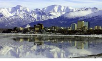
Alaska sees ‘longest stretch of no-nineties in the Alaska climate record, since 1904’ according to the Geophysical Institute, University of Alaska Fairbanks.
According t” Eric Stevens at the Fairbanks Forecast Office of the National Weather Service, more than a decade has passed since Fairbanks, one of the warmest places in Alaska, reached at least 90 degrees Fahrenheit. “August, 1994,” Stevens said over the phone, remembering the last time Fairbanks reached 90 degrees. “This is the longest stretch of no-nineties in the Alaska climate record, since 1904.” Fairbanks reached 93 degrees on Aug. 5, 1994, and hasn’t reached 90 degrees in the 14 years since. Due to its location in the middle of Alaska and far from the moderating effects of the ocean, Fairbanks is a good representative of the warmest summer temperatures in Alaska. Stevens did a little more digging and found that, since 1904, Fairbanks has hit 80 degrees or warmer every single summer. And, during the summer of 2004, when an area the size of Vermont burned and much of the state was choked in smoke, Fairbanks had 30 days with highs of 80 or higher, but never reached 90.
Anchorage hasn’t reached 80 degrees since Aug. 16, 2004, when the temperature was 81 degrees. Before that, the city had an 80-degree drought that went back to the summer of ’97. As of late June 2008, Anchorage hadn’t yet hit 70 degrees for the year, the longest such cool spell since 1993.

See full size Anchorage photo here.
Jun 25, 2008
What the CCSP Extremes Report Really Says
By Roger Pielke Jr., Prometheus
Yesterday the U.S. Climate Change Science Program released an assessment report titled “Weather and Climate Extremes in a Changing Climate” (PDF) with a focus on the United States. This post discusses some interesting aspects of this report, with an emphasis on what it does not show and does not say. It does not show a clear picture of ever increasing extreme events in the United States. And it does not clearly say why damage has been steadily increasing.
First, let me emphasize that the focus of the report is on changes in extremes in the United States, and not on climate changes more generally. Second, my comments below refer to the report’s discussion of observed trends. I do not discuss predictions of the future, which the report also covers. Third, the report relies a great deal on research that I have been involved in and obviously know quite well. Finally, let me emphasize that anthropogenic climate change is real, and deserving of significant attention to both adaptation and mitigation.
The report contains several remarkable conclusions, that somehow did not seem to make it into the official press release. They include: over the long-term U.S. hurricane landfalls have been declining, nationwide there have been no long-term increases in drought, despite increases in some measures of precipitation, there have not been corresponding increases in peak streamflows, there have been no observed changes in the occurrence of tornadoes or thunderstorms, there have been no long-term increases in strong East Coast winter storms (ECWS), called Nor’easters, there are no long-term trends in either heat waves or cold spells, though there are trends within shorter time periods in the overall record.
From the excerpts above it should be obvious that there is not a pattern of unprecedented weather extremes in recent years or a long-term secular trend in extreme storms or streamflow. Yet the report shows data in at least three places showing that the damage associated with weather extremes has increased dramatically over the long-term. Here is what the report says on p. 12: “… the costs of weather-related disasters in the U.S. have been increasing since 1960. For the world as a whole, “weather-related [insured] losses in recent years have been trending upward much faster than population, inflation, or insurance penetration, and faster than non-weather-related events” (Mills, 2005a). Numerous studies indicate that both the climate and the socioeconomic vulnerability to weather and climate extremes are changing (Brooks and Doswell, 2001; Pielke et al., 2008; Downton et al., 2005), although these factors’ relative contributions to observed increases in disaster costs are subject to debate.
What debate? The report offers not a single reference to justify that there is a debate on this subject. In fact, a major international conference that I helped organize along with Peter Hoeppe of Munich Re came to a consensus position among experts as varied as Indur Goklany and Paul Epstein. Further, I have seen no studies that counter the research I have been involved in on trends in hurricane and flood damage in relation to climate and societal change. Not one. That probably explains the lack of citations.
In closing, the CCSP report is notable because of what it does not show and what it does not say. It does not show a clear picture of ever increasing extreme events in the United States. And it does not clearly say why damage has been steadily increasing. Overall, this is not a good showing by the CCSP. Read more here.
Jun 24, 2008
Purposeful Manipulation of Temperature Data or Poor Practice?
By April E. Coggins on Paloustics
Dr. Fred W. Decker, Professor of Meteorology at Oregon State University, signed the 2008 Oregon Petition dissenting from man-made climate fears. “There is no convincing scientific evidence that human release of carbon dioxide, methane, or other greenhouse gases is causing or will, in the foreseeable future, cause catastrophic heating of the Earth’s atmosphere and disruption of the Earth’s climate. Moreover, there is substantial scientific evidence that increases in atmospheric carbon dioxide produce many beneficial effects upon the natural plant and animal environments of the Earth,” the petition that Decker signed states.
Decker also challenged temperature data. “One day the Gazette-Times told of a minimum temperature about 15 degrees Fahrenheit, whereas the radio station at the Marys River bridge into Avery Park reported much colder, a ‘minus’ reading, which agreed with home thermometers of some readers. Inquiring about locations, I learned the ‘official’ minimum came from the shelter atop the steam-heated agricultural building on campus. Moreover, the professor moved the instruments to the greenhouses to the west in the summers when he worked there. What poor practice!” Decker wrote on June 22, 2008. “I appealed to the agricultural dean upon learning of the imminent retirement of the professor responsible. I suggested a site near the KOAC towers if possible. The compromise site at Hyslop got selected, and Wheeler Calhoun’s data got quoted daily in the Gazette-Times” Decker wrote.
In a summer meeting at Pullman, Wash., a German professor from the University of Washington in Seattle told of his study of the records from the central Washington courthouse lawn, which appeared to reveal a cooling trend over many years. En route to the meeting he examined the site. He concluded his report by telling how the instrument shelter stood unmoved with a lone tree south of it having grown taller and wider, casting a mid-day shadow ever larger as the years passed. We all laughed as he smiled at his discovery of the cause for apparent ‘climate change.’ “
It should also be noted that Dr. Decker was one of the 31,000 scientists who signed the Global Warming Petition Project, and one of the over 9000 signers who hold PhD’s. In my opinion, if America can stop the madness of the global warming hysteria before it’s too late, these will be the heroes that saved us. See this post and any comments here.
Jun 23, 2008
Solstice Sea Ice Update
By Joseph S. D’Aleo, CCM, AMS Fellow
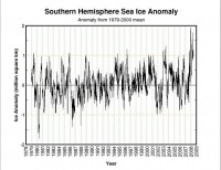
The Antarctic set a new record (since records began in 1979) for sea ice extent at the end of last winter. It stayed well above the normal through the summer with icemelt 40% below the normal. As a new height of irony and hype, the media made a big deal about a fracture of a small part of the Wilkins ice sheet in late February (160 square miles of the 6 million square mile Antarctic ice sheet (0.0027% of the total). Media headlines blared: Bye-bye, Antarctica? and Massive ice shelf collapsing off Antarctica.
But as you can see from this Cryosphere chart below, the extent never dropped to less than 1 million square km ABOVE NORMAL during or after the brief event. Currently Antarctic ice extent is running nearly 1 million square kilometers higher than last year at this time. Peak comes at the end of the southern winter (September).

See larger graph here
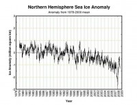
In contrast, the arctic set a record for the least extent since 1979 last September. It recovered at a record pace in the fall and reached levels more like several years ago this past winter.

See larger graph here
Last year the upper level pattern in June was very anomalous with a strong ridge of high pressure and warm surface temperatures. The ice melt was rapid. that blocking high pressure led to anomalous warmth near Siberia and Bering Strait and near Greenland leading to rapid ice melt. The surface wind flow helped drain ice from the arctic into the Atlantic at a much higher than normal rate. This year for the same 20 day period, there is a cold trough migrating around the Arctic Ocean with blocking confined to Greenland. The result is temperatures much closer to normal over much of the arctic and cold pools near the Bering Straits and Siberian coast. Models suggest the cold pool strengthens some in the arctic the next few weeks. It is a long time until September, but if the pattern persists, we will likely come up short of last year’s record.
The global sea ice which has been running above normal is now near normal.

See larger graph here
See side by side ice comparisons of the arctic in 2007 and 2008 and more of the patterns leading to the differences and some of the reasons the Arctic has been melting again like it did in the middle of the last century during the end of the last warm period here.
|
|
|
|


